
The Lantern
Role:
UX Designer
Responsibilities:
-
User interviews
-
Paper and digital wireframes
-
Low- and high-fidelity prototypes
-
Usability studies
Design Challenge:

Product:
I decided to create an app for a hypothetical restaurant in Bengaluru called "The Red Lantern" that serves east-Asian cuisine.
User Research:
To get a better understanding of user needs, I reached out to people who frequently eat out to understand their experience with digital menus at restaurants. I identified two user groups - a younger, tech savvy cohort and an older generation that might have accessibility concerns.
From the insights gained during my research, I designed user personas, user journeys and user stories.

User Persona created with details like goals & background for the persona.
User pain points:
1. Most users found it difficult to read digital menus currently used at restaurants.
2. Customers were frustrated to find that items on the menu were not available.
I also found that there were no language options for any of the apps that I'd encountered. India's a multilingual nation, so it would be really useful to be able to access a menu in your native language.
Initial Designs:

Paper wireframes with: main screen, menu section, item details, order screen and feedback.

Low-fidelity prototpye.
Once I had an idea of the users I was designing for and their pain points, I started making sketches of the app. I tried out different versions of various screens on paper till I settled on a final design. I then made digital wireframes on Figma.
To address the main user pain points, I made sure the app was legible and added information to show the availability of items on the menu, along with preparation time.
I also included a translate option so users can view the menu in different languages.
Usability Tests:
Once the low-fidelity prototype was ready, I setup and conducted a usability test with 5 users to see if my designs solved the problems identified and were easy to use.
These are the findings from the tests:
-
Menu sections need to be easily accessible
-
Users need a better cue for adding an item
-
Order icon was confusing
Based on the results from the usability tests, these are the changes I made to the design:
1. I changed the menu from a hamburger menu to "bubbles" so that users could access different sections in one click.
2. Instead of a counter to add an item, I used an "Add" button to make it easier for users to spot the button.
3. I changed the icon for the cart from a "cloche" to a cart symbol.
High-fidelity Prototype:

Home screen
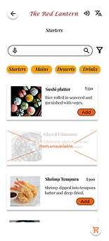
Starters section

Item details
For the final step in the process, I had to make a high-fidelity prototype. For this, I added images, colours, typography and icons to the design. I chose to use icons from Google's Material Design platform as they had a clean design. As for the colour scheme, I went with a red/orange base as the app was for a restaurant and the colour often appears in east-Asian culture. I went with a decorative font for the heading with a serif-sans pairing for the content.
Things I learned:
I learned that designing is an iterative process, and usability tests provide valuable feedback on what users expect. It's important never to assume what the user wants and always remain open to feedback.
Possible next steps:
1. Conduct further research to see if any additional features need to be added.
2. Consider if any AI tools can be included in the app to improve the experience.